FinWise HubCash Flow View
FinWise HubAnalyzeCash Flow View
Cash Flow View
1 min read
The Cash Flow view visualizes how money flows through your finances using a Sankey diagram. See the relationship between income sources, spending categories, and savings.
Understanding the Diagram
The Sankey diagram shows:
• Left side: Income sources (salary, freelance, etc.)
• Middle: Category groups
• Right side: Individual categories
Flow width represents the amount - wider flows = more money.
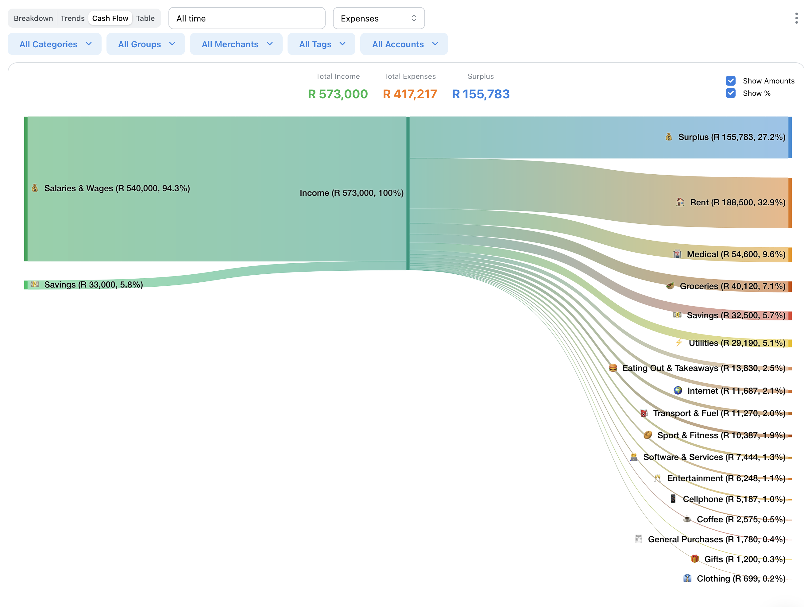
Income to Categories
Follow the flows from income on the left to see where your money ends up.
This visualization makes it easy to see the proportion of income going to different areas.
Interpreting Results
Look for:
• Large flows to single categories (potential savings opportunities)
• Balance between essential and discretionary spending
• Savings rate (if you have a savings category)
Related Articles
On this page