FinWise HubBreakdown View
FinWise HubAnalyzeBreakdown View
Breakdown View
1 min read
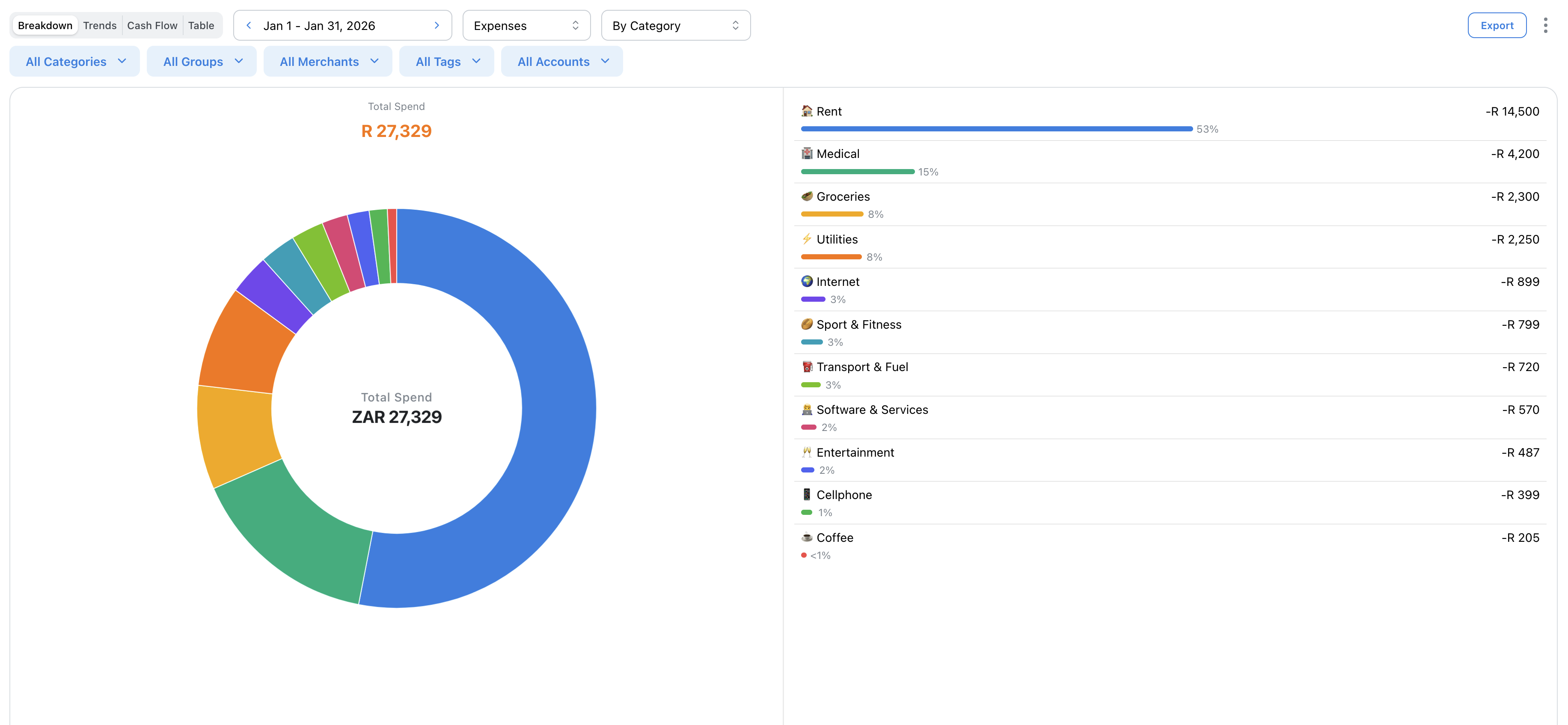
The Breakdown view shows a pie chart of your spending (or income) by category. Quickly see where your money goes and identify your biggest spending areas.
Reading the Chart
The pie chart shows each category's share of your total spending. Larger slices = more spending.
Hover over any slice to see the exact amount and percentage.
Breakdown Types
Choose how to group your data:
• By Category - Individual spending categories
• By Category Group - Grouped categories (Food, Transport, etc.)
• By Merchant - Where you spend money
Category Group view is great for a high-level overview.
Drilling Down
Click any slice to see the transactions that make up that category. A popup shows all matching transactions with details.
From there you can edit, recategorize, or tag transactions.
Related Articles
On this page